From ceilings to code
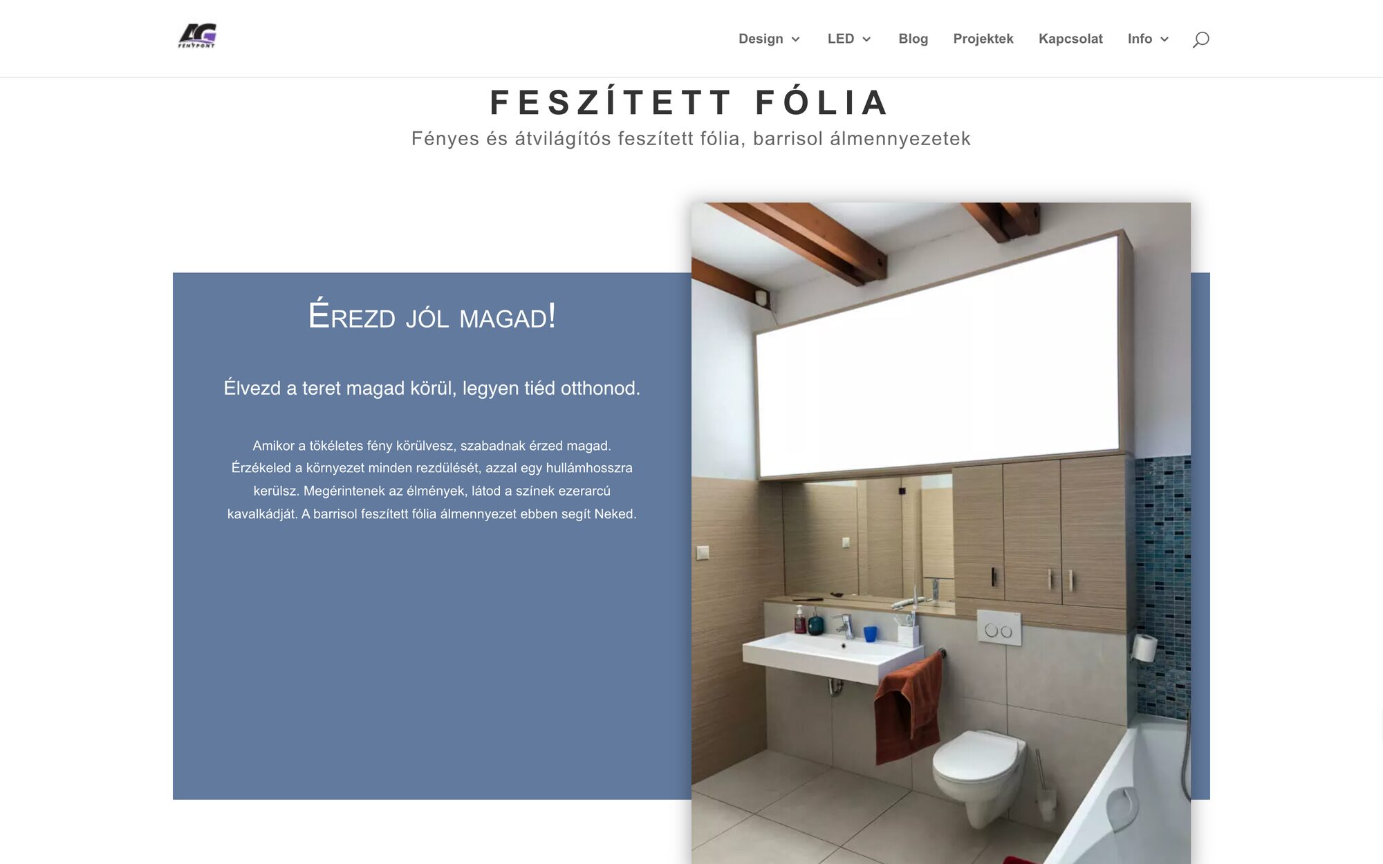
In the summer I worked for the company, building stretched-foil ceilings. Then I redesigned their website: the content architecture first, then the design in Figma, then a full build in Laravel.
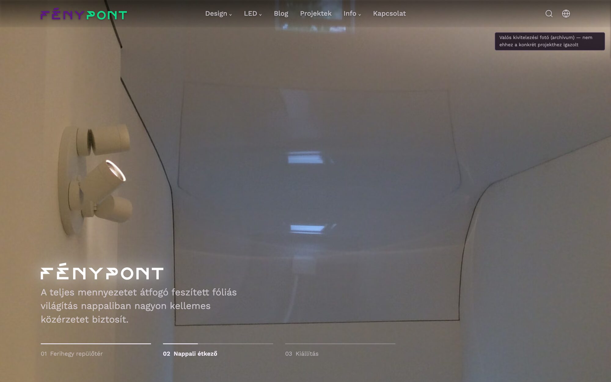
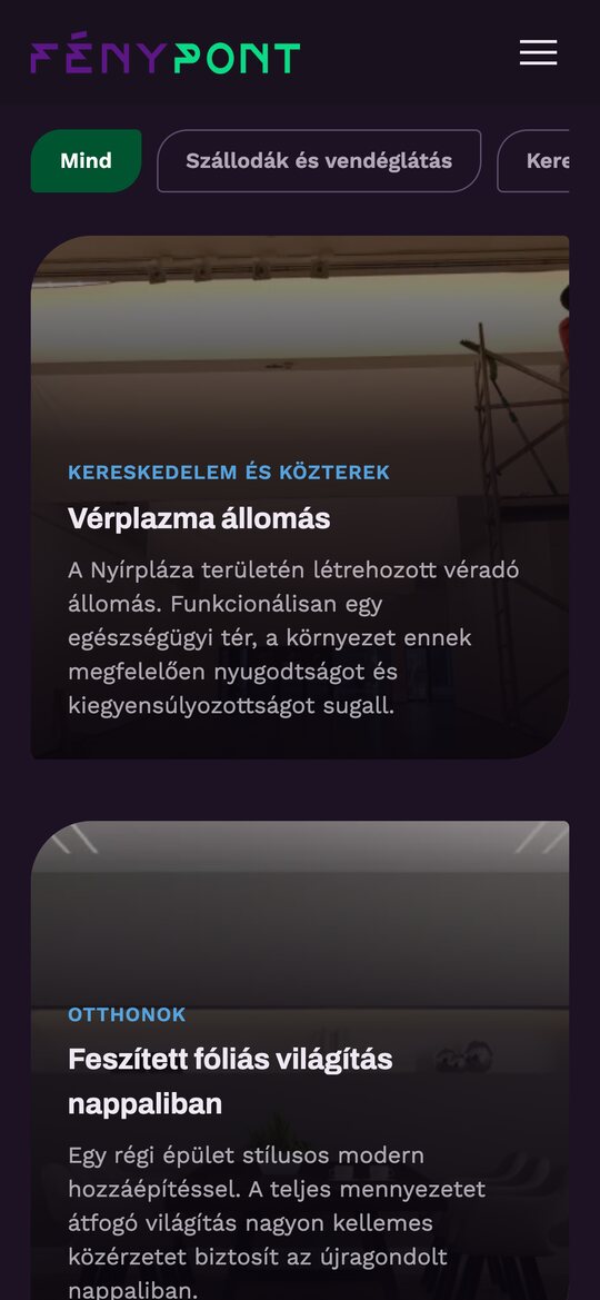
The palette is dark plum and forest green, with text at 70 to 95% opacity instead of stark white: dimmed gallery lighting, so the photographs of their work carry the visual weight.
The redesign runs as a complete local build. The live site is still the original.
What changes
The old site’s biggest problem was flatness: page after page of one photo and dense paragraphs. Cutting the text was not an option, because about nine in ten of their customers read everything before they call. So the redesign keeps every word and gives it shape.
Projects by the kind of place
The old filter sorted projects by media, and 11 of the 14 projects shared one tag, so it barely filtered anything. The new categories come from what the projects actually show: hotels and hospitality, shops and public spaces, homes, exhibitions and installations.
Honest about every photo
Many projects have no photo of their own yet. Rather than a stock photo that doesn’t match, every stand-in says so: a small note marks archive shots and placeholders.
History as a timeline
The company’s story since 1989 used to be dense, centred columns. Now it is a timeline in five eras, from museum lighting and stretched foil to work abroad, 3D solutions and general contracting, with photos along the way.
Made for phones
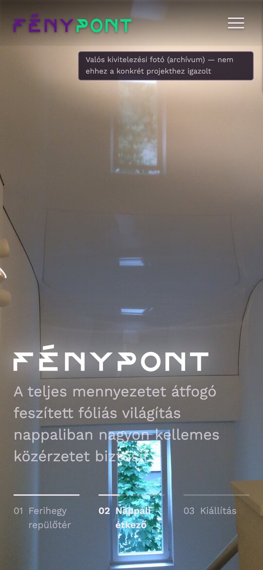
On a phone the pages stack into one column. Anything the desktop reveals on hover is simply shown, because opening it on tap would push the page down mid-scroll, and sequences such as the hero stay horizontal and swipeable.
Under the hood
- 3.1Every text on the old site was saved and audited before the rebuild.
- 3.2Built for two languages: Hungarian first, with the language switch, locale handling, hreflang tags and sitemap entries for English in place.
- 3.3Responsive images in AVIF and JPG.
- 3.4A live search, grouped by category.
- 3.5Projects with filters and a lightbox.
- 3.6SEO metadata and a sitemap.
- 3.7Automated tests.